Silver Ford Pickups
Brand Identity & Merchandise
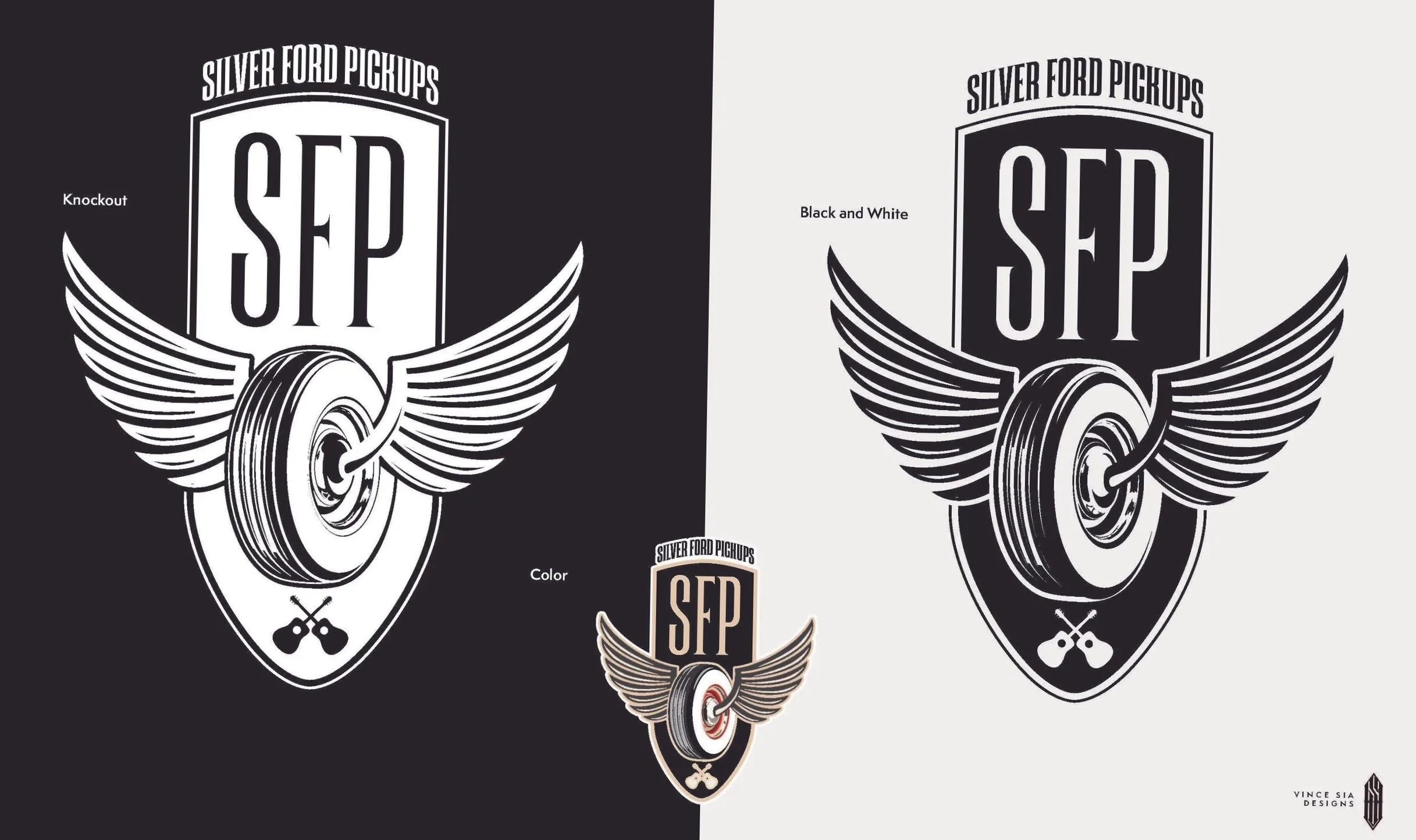
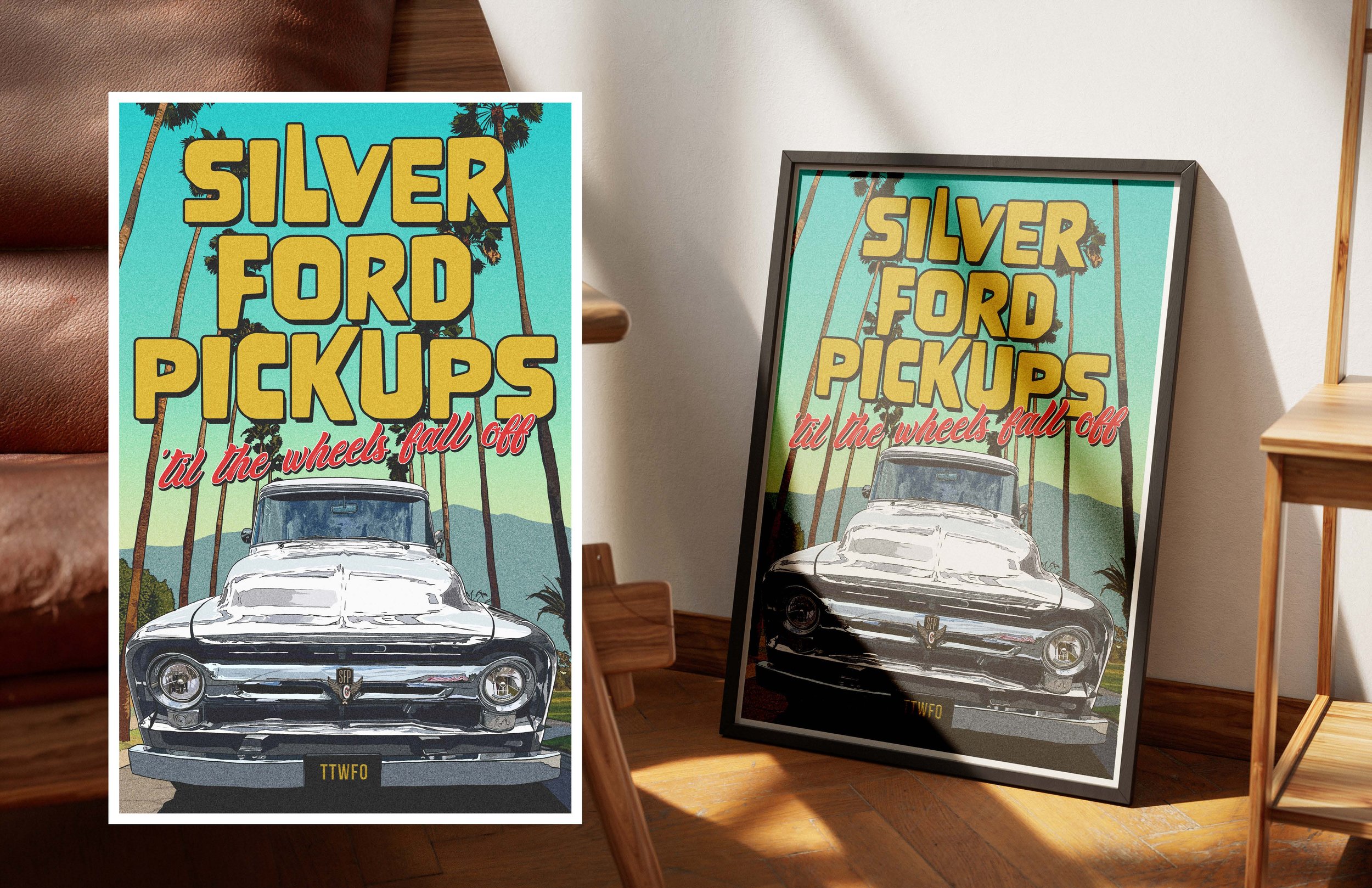
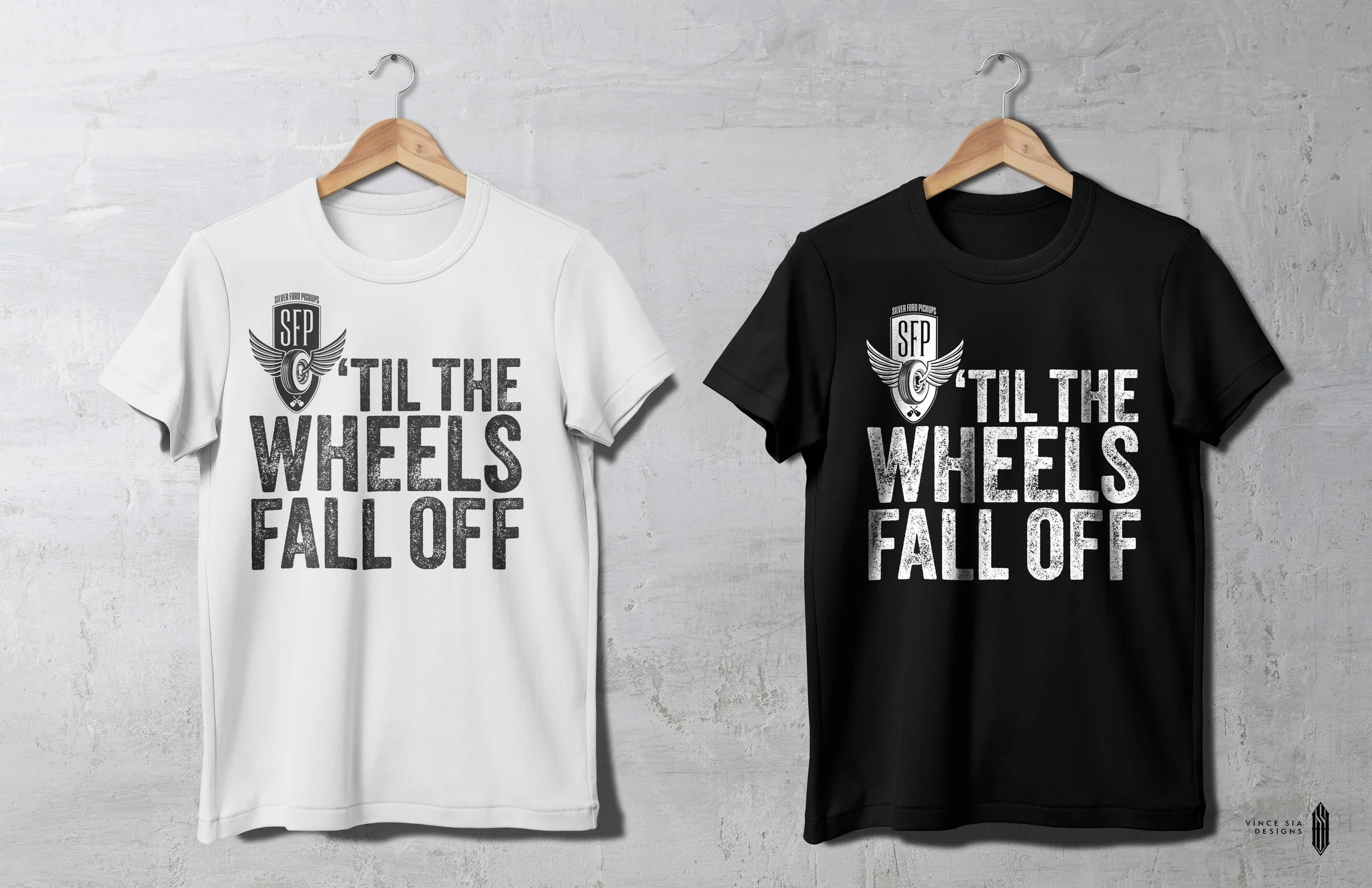
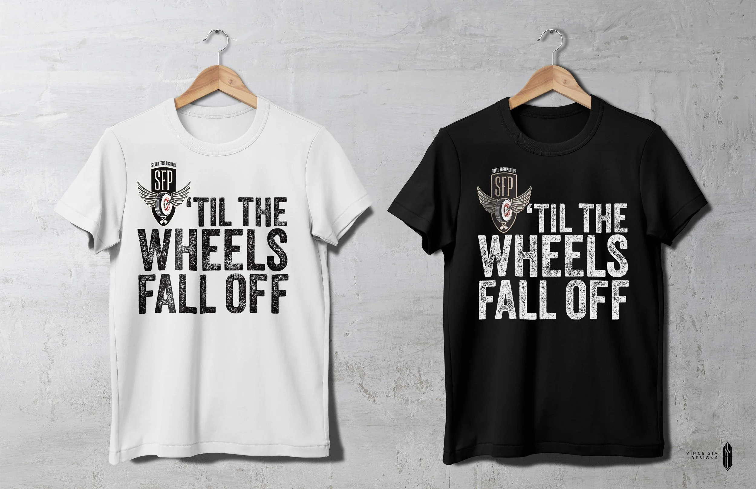
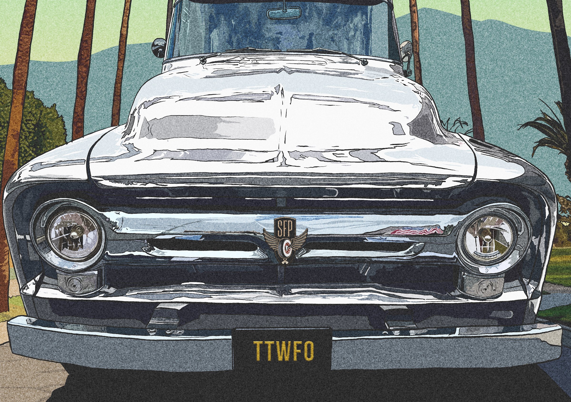
Rooted in classic Americana with a rebellious edge, the Silver Ford Pickups identity captures the spirit of a Southern California acoustic duo with a distinct sound and attitude. The project focused on creating a distinctive logo and branded merchandise that feel as authentic and enduring as the music itself. The “Souls” logo brings that spirit to life through a vintage-inspired shield, bold typography, and a winged wheel, which serves as the centerpiece, symbolizing the souls of the tires destined to keep rolling until they finally fall off - a direct nod to the band’s tagline, “Til the Wheels Fall Off.” Subtle crossed-guitar details connect the automotive influence to the duo’s acoustic roots, creating an emblem that feels both timeless and unmistakably their own.
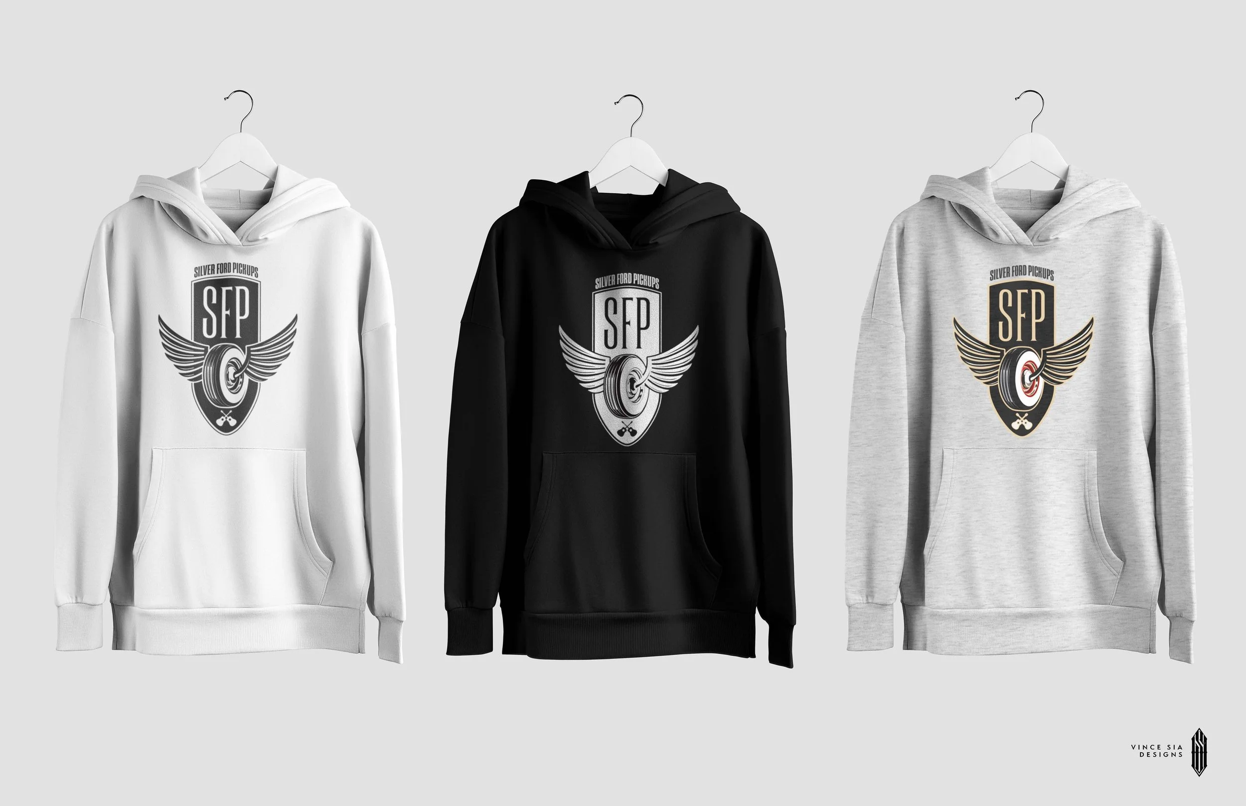
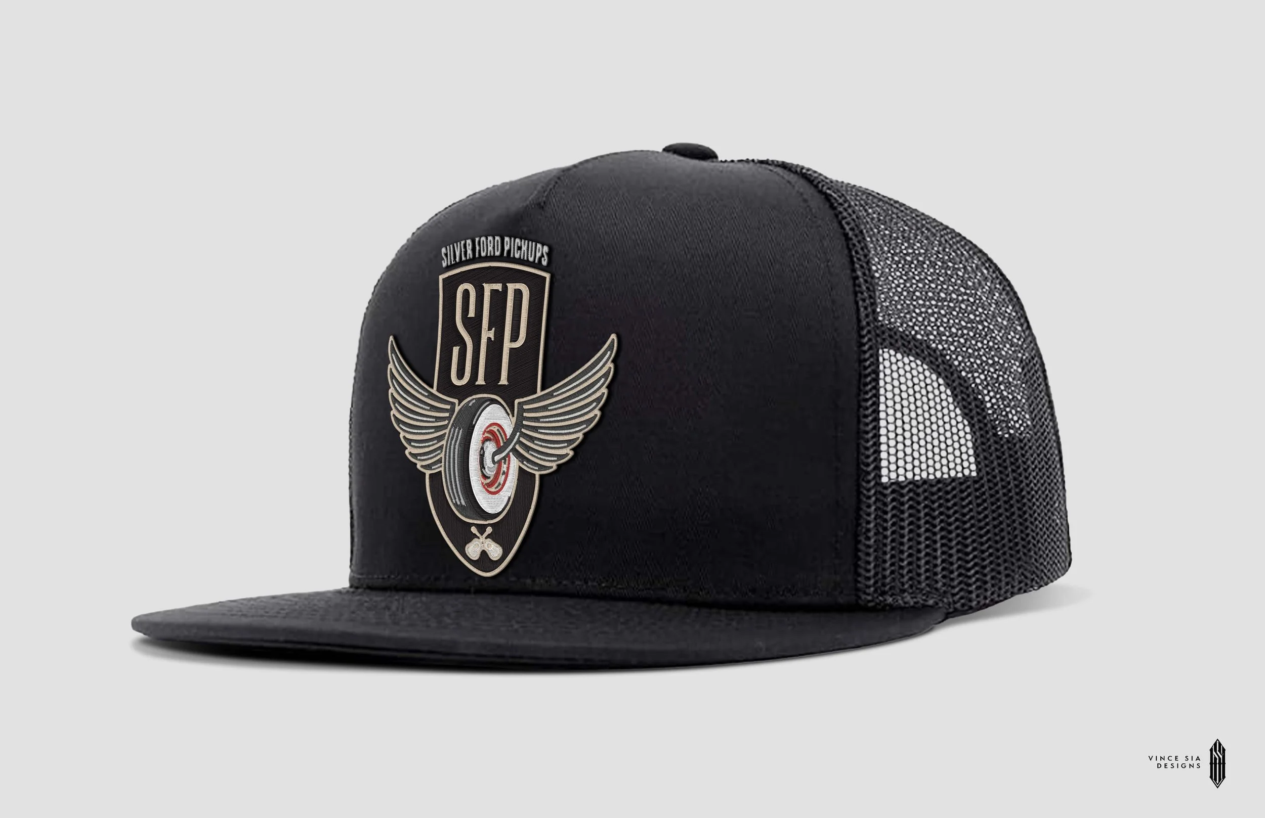
Designed to translate seamlessly across apparel, hats, and other merchandise, the identity gives Silver Ford Pickups a look that extends beyond the stage. Bold, memorable, and built to last, it’s a badge of honor for the music and a band that keeps rolling no matter what.
Art Direction, Logo Exploration, Merchandise Design
Adobe Illustrator, Photoshop